Enhancing user experience and driving conversions through a structured, user-centric design approach.
A content-driven food blog platform approached us to redesign their website to improve content discovery, increase user engagement, and create a more structured and visually appealing reading experience.
The Problem
The existing platform faced several usability and performance challenges:
Users were leaving quickly due to cluttered layouts and poor readability
Recipes and articles were difficult to find due to lack of categorisation and filtering
Content-heavy pages lacked hierarchy, making them overwhelming to navigate
Users were not exploring beyond a single page or recipe
Reading and navigation were not optimised for smaller screens
The Solution
We redesigned the platform with a focus on content clarity, intuitive navigation, and engagement-driven design.
Structured Grid-Based Layout
A modular grid system was introduced to ensure consistency, improve readability, and create a seamless browsing experience across all pages.
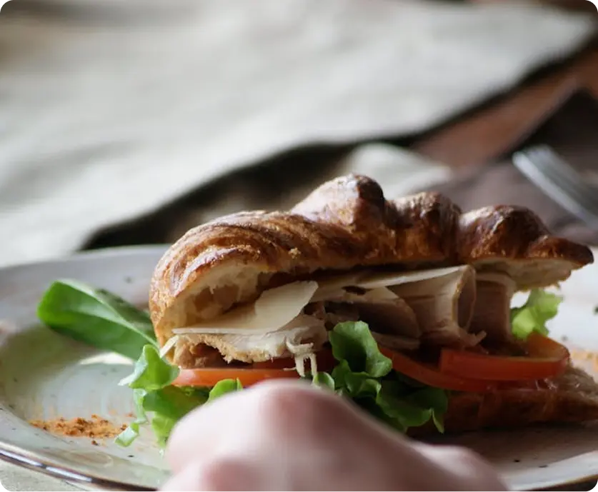
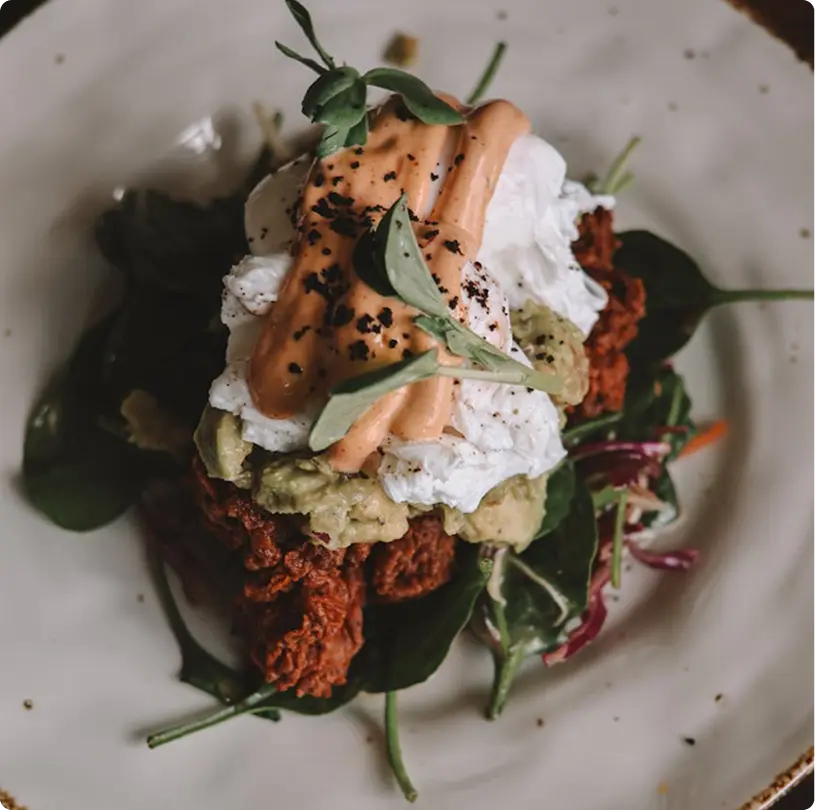
Improved Recipe Pages
Recipe pages were redesigned with high-quality visuals, clear pricing, strong CTAs, and relevant product recommendations.
Advanced Filtering & Search
Users can now filter products by category, size, price, color, and collection, making product discovery faster and more intuitive.
Engagement-Focused Features
The current features were simplified to reduce friction, enabling faster and more efficient experience.
Measurable Results
We've helped founders build products, acquire users, and scale revenue. Here's what we've done.
+0%
Increase in user engagement
-0%
reduction in bounce rate
+0%
increase in average session duration
Grid-Based Layout Highlights
The redesigned interface follows a structured grid system that enhances clarity and scalability.
Consistent recipe card layouts
Balanced spacing for improved readability
Clear hierarchy across content-heavy pages
Flexible system for adding new categories and content
Filtering System
To improve usability, a robust filtering system was introduced:
Category-Based Filtering
Preference-Based Filtering
Sorting Options
Flexible design system for future scalability
Tools Used
The redesigned platform successfully transformed the food blog into a highly engaging, user-friendly content hub. By improving content structure and discoverability, the platform now encourages deeper exploration, longer sessions, and repeat visits.
See how we've helped businesses like yours transform their digital presence into
revenue-generating machines.
Beauty Project Platform Design
Transformed a fragmented beauty platform into a seamless, high-converting digital experience through intuitive UX design and user-centric optimization.
Transformed an underperforming wine e-commerce store into a high-converting digital storefront through strategic UX redesign and conversion optimization.